BRANDING INTERNATIONAL GOOGLE UX
2015
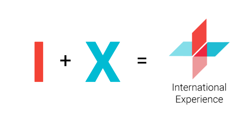
During a 3-months assignment at the International Experience at Google, one of my main achievements was to propose the Branding for the team. IX is a User Experience team focused on researching and designing how Google users at emerging markets (Brazil, India, Mexico, Indonesia and Russia) engage with technology.
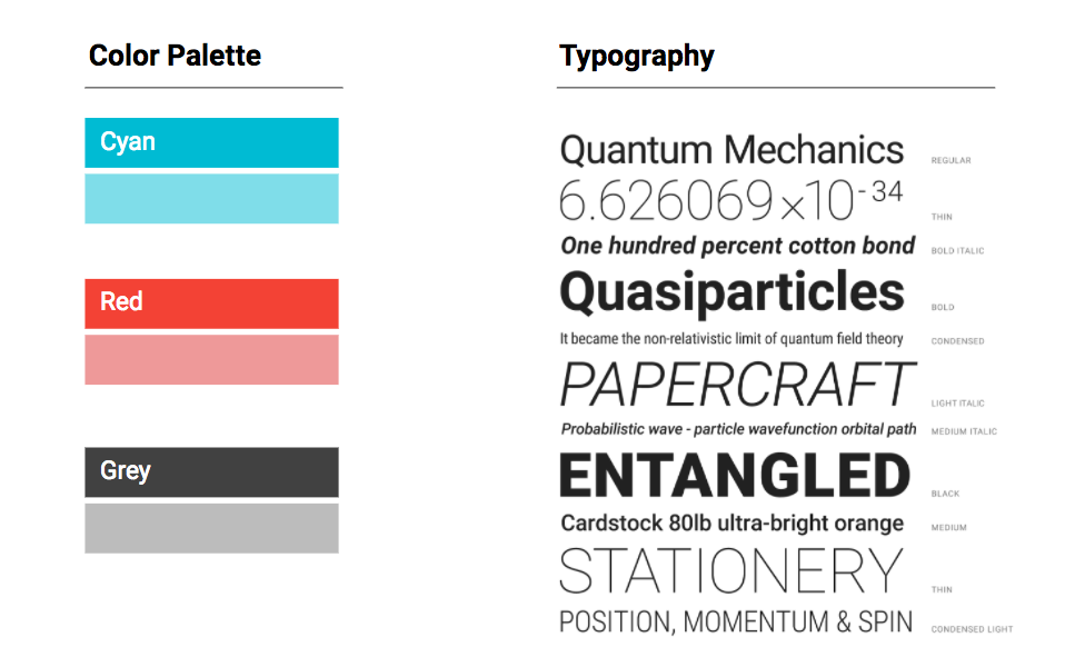
Their brief for the brand design was to represent the blend of different cultures, without using one specific color that could relate to one of the countries they worked for and it also had to follow Google's Material Design guidelines.
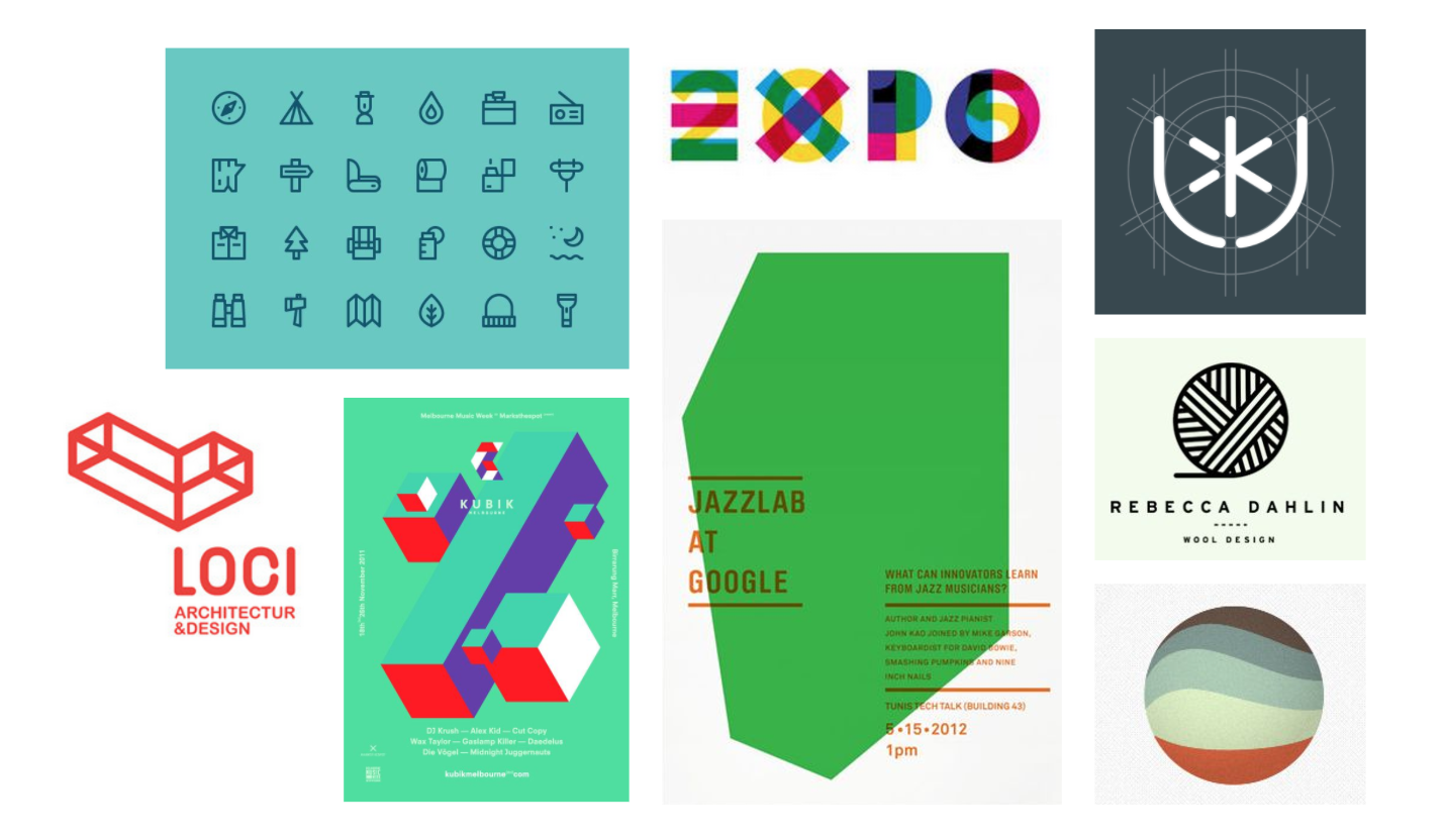
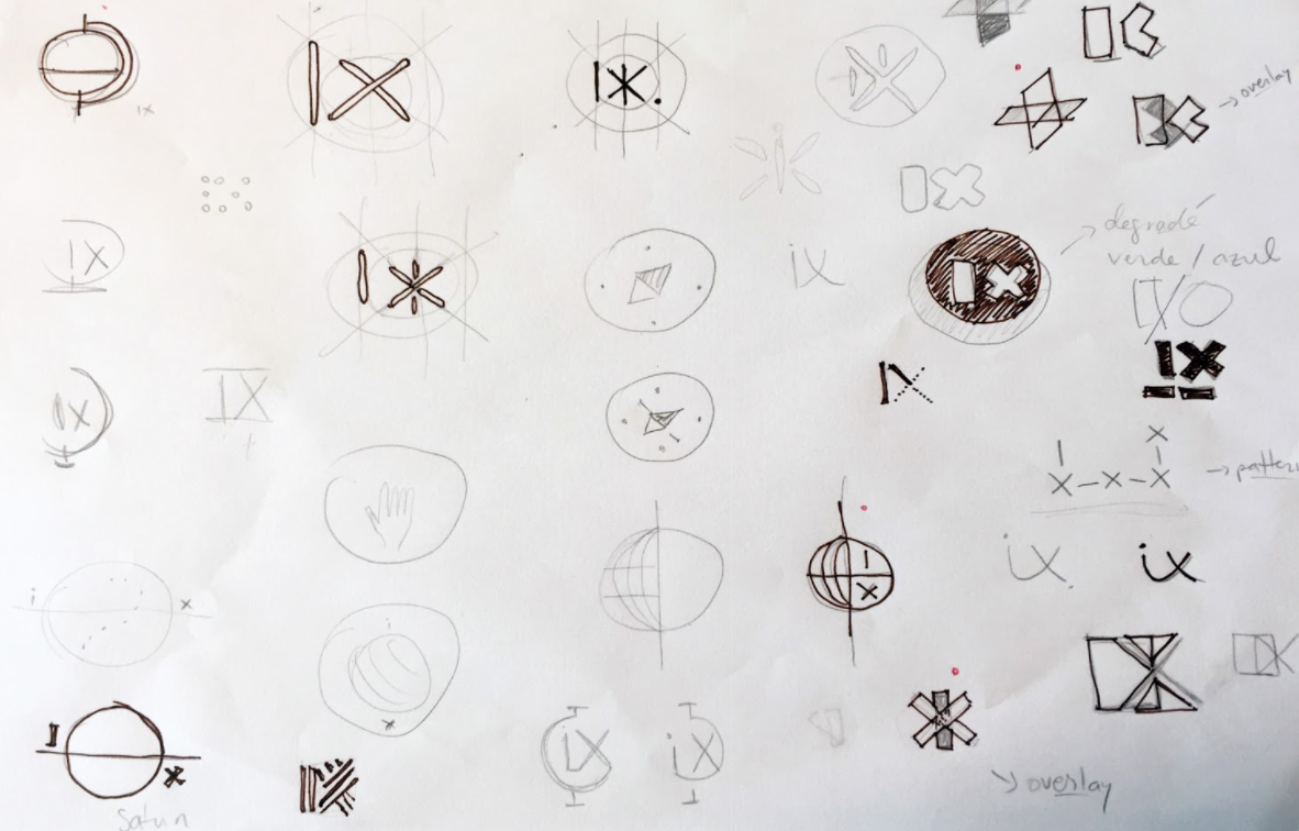
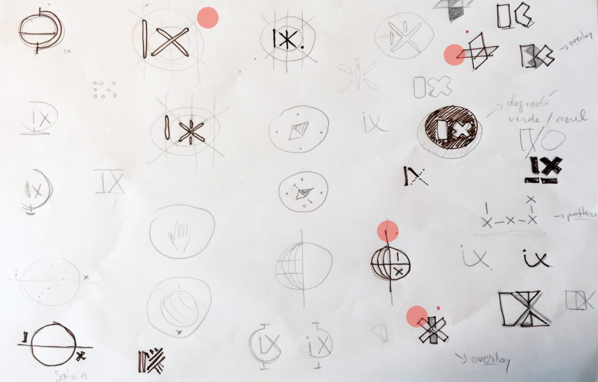
After collecting the first references, I started sketching possible solutions, which ranged from designs that represented the global team and, on the other hand, simple ways of using the letters I+X (International Experience) and picking with the Head of Design (Laura Garcia-Barrio) the 4 most interesting proposals.

The final result is as presented below, where the final design decision was to use the I+X letters overposed and summing-up each other, which pleased the team and was highly praised by other UX teams at Google.
